G'day all, I hope everyone had a good new years day and that this year will be a much better one than the last. Unfortunately last year was not a very good one for our family, particularly for my wife, as her health had deteriorated very quickly. But there is a light on the horizon and she is now beginning to recover once again.
Now that I am able to focus on the inconsequential things in life such as painting and drawing I thought I'd share a head study and its process. It has been soooo long since I've painted anything that I was afraid I might ruin it. Anyway here is the finished piece below 9"x12.5" it is of the model Elsa Hosk. I came across a b&w photo of her and something clicked in my brain that I had to paint it. Now unfortunately I couldn't find an actual colour photo of the same picture so all the colour you see is from scratch, so I took liberty of hair and eye colour etc.
Below is the initial graphite drawing on 300gsm watercolour paper mounted on tempered masonite.
Before I glued the paper to the masonite I very LIGHTLY dampened the masonite and brushed a very thin milky coat of PVA glue. Reason that I did this is that if your paper is TOO wet any residual dust of the masonite can stain though to the paper and that means acid gets into the paper. Once the masonite is dry(I left mine overnight) I then wet the paper and added a liberal amount of glue to the masonite and place the paper which I then use a roller to ease all the bubbles and wrinkles out, then I let that dry overnight. Just a tip, don't let your paper get too wet, just enough to stop the glue sucking up into the paper to much.

Below I'm ready for the first coat of acrylic matte medium. I just used a soft brush as I didn't want heavy brush strokes showing, I'm not a big fan of surface texture. Just keep a tin of water close by to wet the brush every now and then to help the medium cover easier. Here I used about 40ml overall for this painting, oh and don't forget to paint the edges of the masonite incase the oil paint gets on it and interferes with the masonite's integrity.
Below I squeezed Burnt Sienna straight from the tube onto the surface and rubbed it down with a rag to get an even coat(you can also do this with a brush) for my underlay. I used the rag to pull out the paint for the lighter areas and for the really white areas such as the bubbles I use a rubber shaper, they are pretty good at lifting out paint.
Below I started to work the background and water which I did in one pass.
Here I began my first pass for the skin tone using yellow ochre, english red and raw umber. I basically plotted out my light and shadows. Looks more like zombie flesh at this stage.
Below is the second pass for my skin tones adding the yellow for the forehead, red for the cheeks and neutralising around the mouth. I thought I best add some colour for the hair to see how the darker value would go against the rest of the head. Around the eyes as I added the dark lashes and brows as the drawing underneath started to fade from the covering paint.
From the last step to this one below I worked the skin tones quite a bit as I wasn't happy how the left cheek was coming along regarding hue, it had turned a brown that just wasn't working at all. It's these times that I leave the painting dry and come back to it the next day so I can se with fresh eyes and decide how to tackle the problem.
It took me some time to get to the stage where I was happy with the skin tones. One of my goals in painting flesh is not to have it look like plastic as seen in many paintings these days.
William Whitaker is one artist that is fantastic at achieving this effect, needless to say he's one of my favourite artist. By this stage of the painting it's time to hone in on the details and do all those fiddly bits that make it all gel together.
Well here it is with all the details completed. I added a glaze of indian red over the cheeks as they just weren't rosy enough. I had some conflicting moments with my water bubbles as I couldn't get them to look right but I think I pulled it off well enough in the end.
I also have to give a big HIP HAZZAR! to my dad who bought me proper lights to take pictures of my paintings, as you can see it turned out smicko! The previous wip shots where taken on the back veranda.
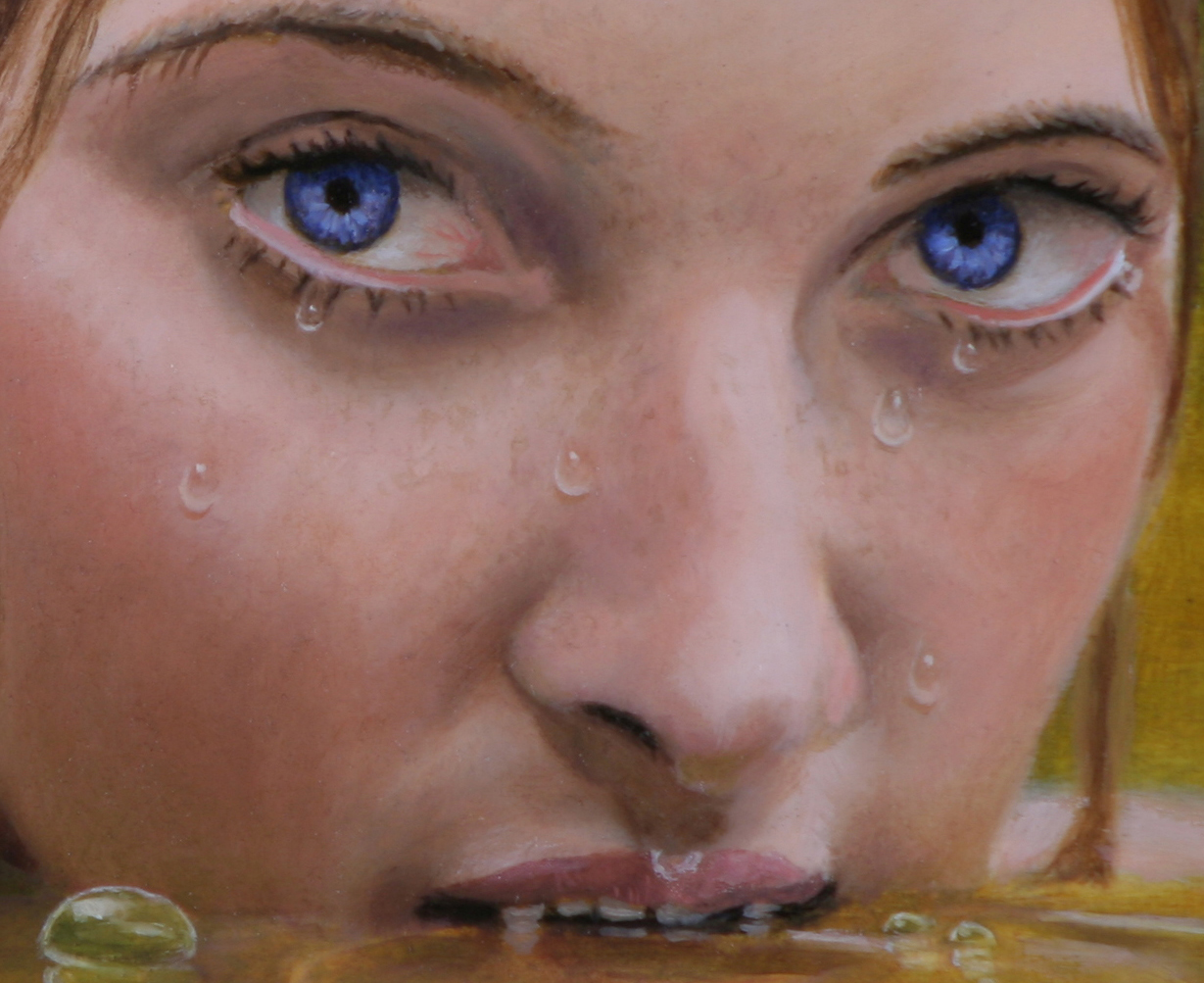
Here's a close up. I'm rather happy about how the water droplets came out, I had to do a little research on how to paint them. And I very much love my freckles on a woman's face, I guess it's because I'm an Aussie ;)
If you enjoyed reading this post, I encourage you to hit the follow button as it encourages me also to put up these works in progress shots. Or if you know someone that wants to paint in oils and think some of my tips might help them please let them know.
Cheers, Rick.


 So here's the latest update. As you can see I've done quite a bit on the insect-like ship. I decided to go with a green metalic colour scheme. I'll wait 'till the ship is totally dry before I attempt any further painting. While waiting for the lower part to dry I started painting in the males head. I laid out globs of paint in value strings of 1,3,5,7, and9. In those strings I have Yellow Ochre, Terra Rosa and Grey.


 On my preliminary drawing I added in Minus Tirith to work out the perspective and placement. Once done, I used tracing paper to transfere it over onto my painting. I dry brushed some raw umber on the back of the tracing paper and then carefully placed it over my painting. I then ran a pencil over the lines which left small traces of raw umber lines of Minis Tirith...wahlah!
 So here I've started on the Nazgul's wings...and still a long way to go.


 Here is another postcard art in gouache. I'm finding that this medium would be good for colour studies for larger projects. Still, there is a far road to travel before I could say that I'm at least proficient at gouache. I still prefere it to watercolours and a lot more than acrylic...blah! ;)
 My wife had bought an old ornate oval picure frame which had been guilded in gold. She found it at the local op-shop for $4, What a bargin!!! Even though some of the gold has worn off, it is still a very nice frame. She reqested that I do a portrait painting with a victorian theme with curly hair. So in the end I decided to paint Jason Issacs in the character of Captain Hook from Peter Pan. I wanted to paint in a more painterly style this time round so it's a little different how I would normally paint. I enjoyed the challenge of this one and I hope you enjoy looking at the result.